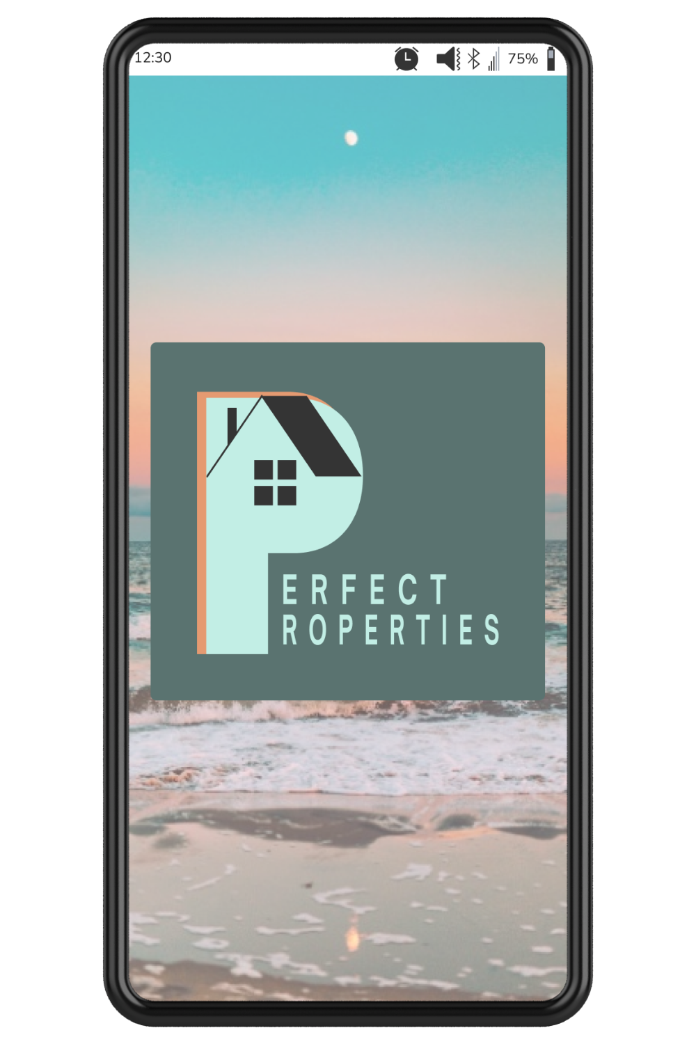
Meno On the Go
A mobile app designed to support people experiencing perimenopause
Role
Duration
8 months
UX Researcher
UX Designer
Tools


The idea for Meno On the Go came to me after I realized how little information and support there was for people going through perimenopause. Many doctors dismiss perimenopausal symptoms as "just part of aging," leaving people to suffer in silence. This lack of understanding and support can be particularly challenging for those who are experiencing symptoms that are affecting their quality of life.
I wanted to create an app that would fill this gap by providing reliable, evidence-based information about perimenopause, as well as a community where users could connect with others and feel less alone. I aimed to create an app that was easy to use, visually appealing, and personalized to each user's needs.


I started this journey by researching the products that were already out there to see how I could bring something different and fill a gap. I analyzed:

balance - Menopause Support
balance is brought by a renowned specialist in the UK, Dr. Louise Newson.
The app brings resources that are primarily informational in nature.
They also seem to have issues issues with the app: crashes on many devices, difficulty downloading reports.
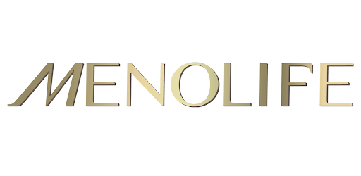
Menopause Tracker
Menolife focuses on tracking symptoms with the purpose to sell their products from the umbrella company, MenoLabs.
Both companies claim that they offer a community but the access wasn’t clear with Menolife, and participation was lacking with balance.

In order to gain a deeper understanding of the experiences and needs of women going through perimenopause, I conducted a survey. I wanted to:
Understand the users behavior and challenges around perimenopause.
Identify their needs during that challenging time,
Determine if they use other apps
The survey had 49 eager participants, many of whom took advantage of the “other” option to share additional information beyond what was provided in the survey questions.
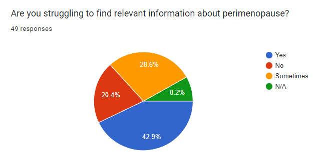
80.4% of respondents turn to internet to learn more about their health challenges.
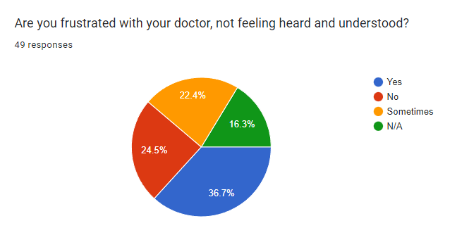
Very few turn to doctors and specialists (19.6% and 8.7%). There is a lack of confidence in the medical providers as people often feel dismissed, invalidated, and not supported.
On internet, many search to find more information about their symptoms, how to relieve them, effective alternative, natural remedies and to find community.

While the survey was helpful and allowed me to gather quantitative data, I wanted to know more about the reasons behind their answers and about their thought process.
I’ve interviewed 4 women between 42 and 45 year old who are going through perimenopause. What I learned was unexpected and revealing of their challenges and needs. An app with valuable resources about physical, mental, and spiritual health for this specific audience is definitely needed.
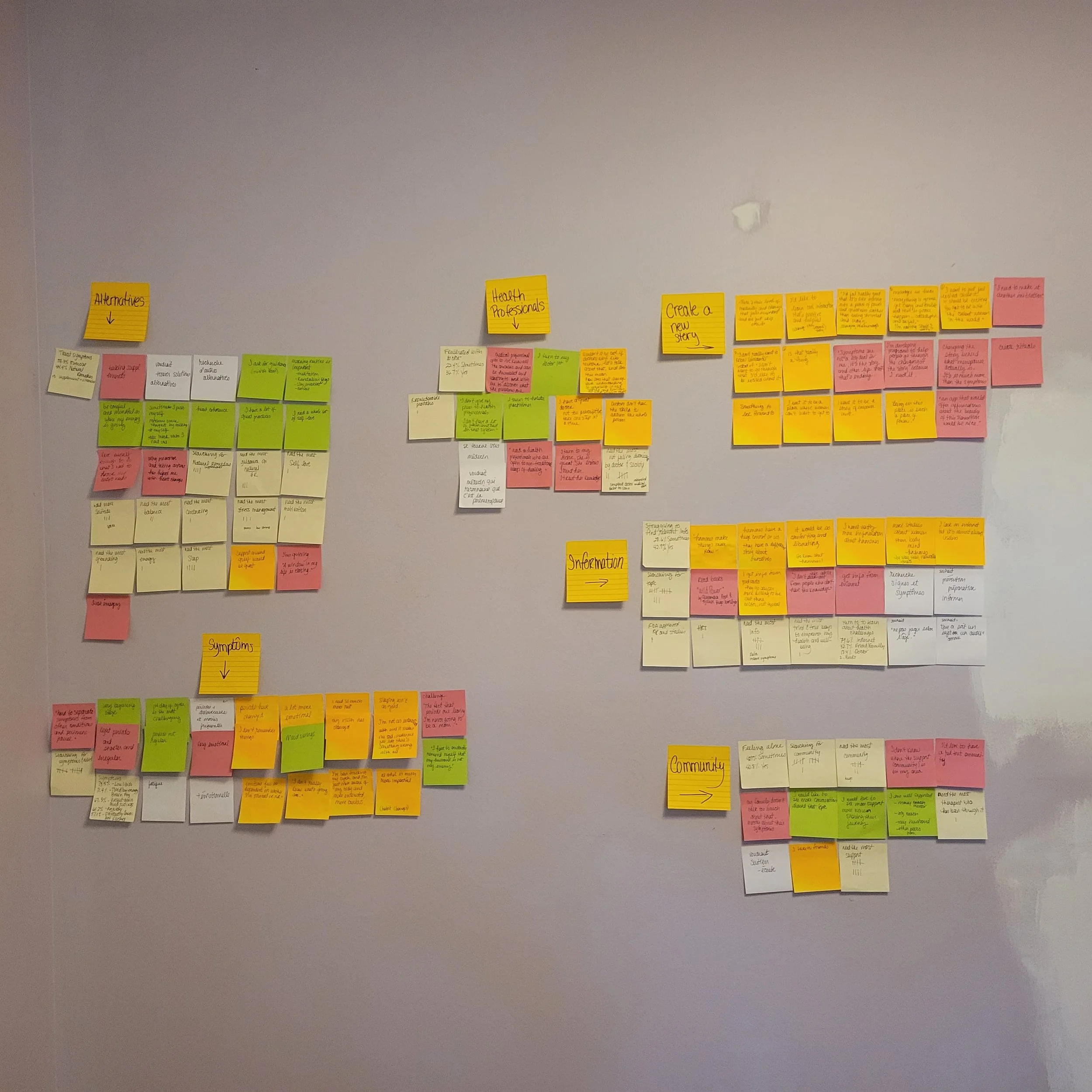
Here are a few insights gathered from the interviews:
Perimenopause is so much more than the physical symptoms and learning how to deal with them. It’s a deep life transition in which women go through many changes and losses in their physical, emotional, mental, and spiritual lives.
Women want to be heard, validated, understood, and supported by their family, peers, health professionals, and unfortunately, very few have found that.
Because so many women have been ignored, dismissed, and invalidated by their doctors, they turn to internet for information, but it’s hard to find good, relevant, and useful information.
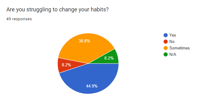
Many women have lost trust in the medical system and turn to alternative ways to treat their symptoms.
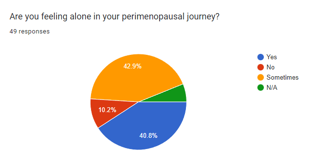
Women want to know they are not alone in this journey and many feel like they are. They want to gather but don’t always know where to find their people: Other women going through similar things as well as competent, compassionate, and understanding doctors.
“Changing the stories behind what menopause actually is would be great! It’s so much more than the symptoms.”

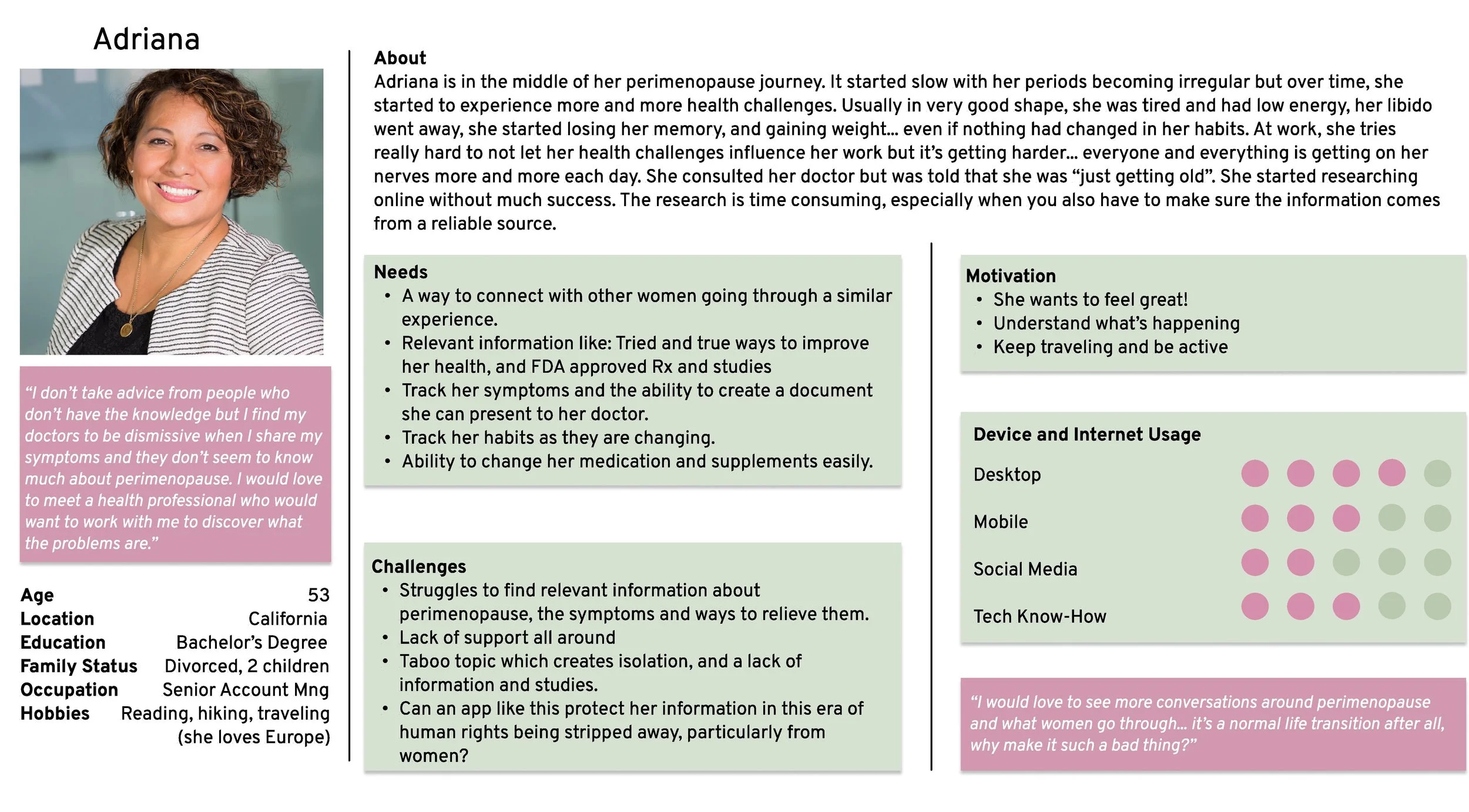
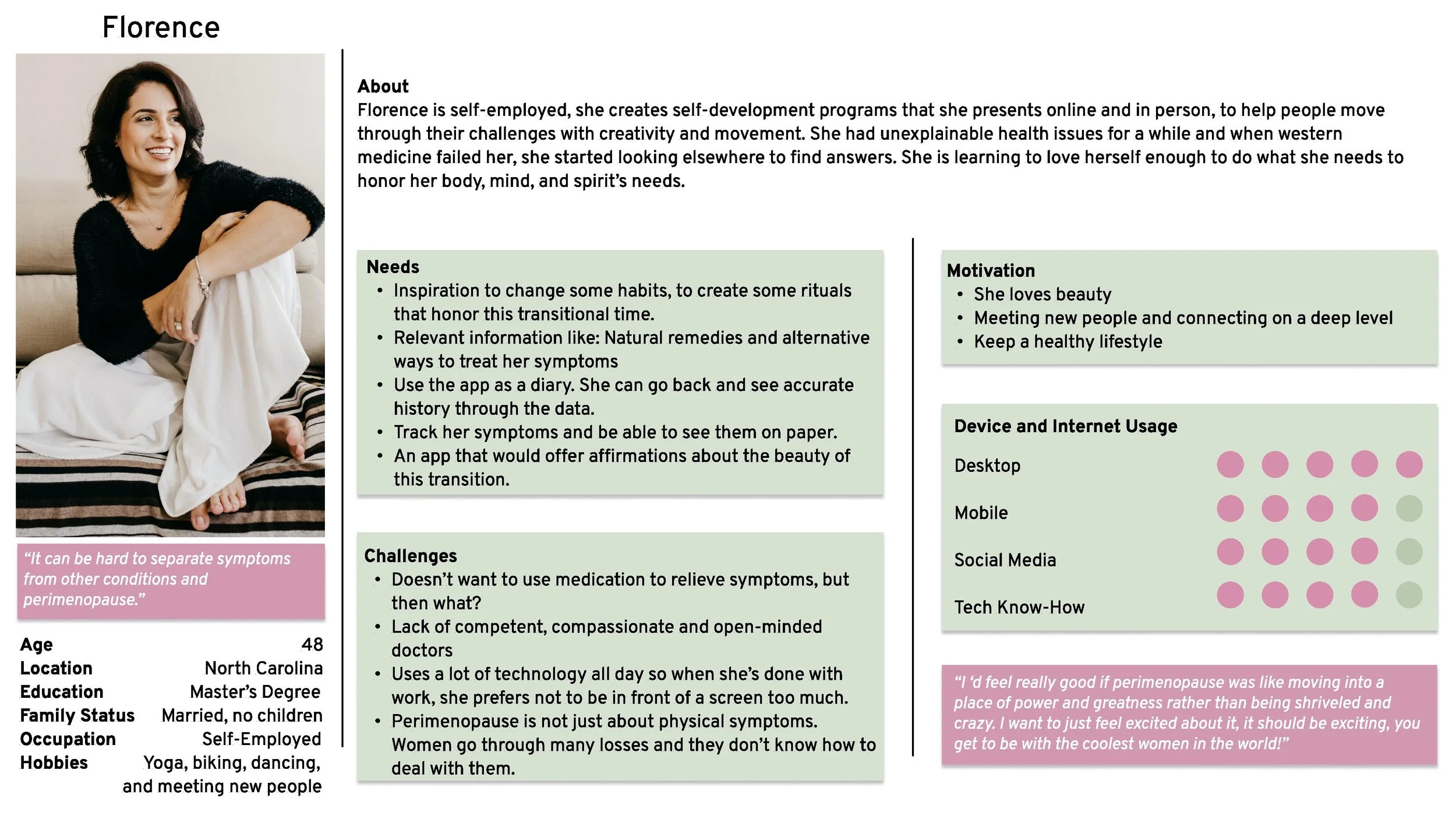
Based on the information I gathered, I created 2 personas that represent my main findings. Meet:
Adriana
53, professional, divorced, mother of 2 adult children.
Active and usually in very good shape, but in the last few months, she has experienced many health challenges.
When she brought it up to her doctor, she was told that she was “just getting old”.
Florence
48, self-employed, no children.
Loves connecting with people.
Into self-development, creativity, and finding a more holistic approach to health.


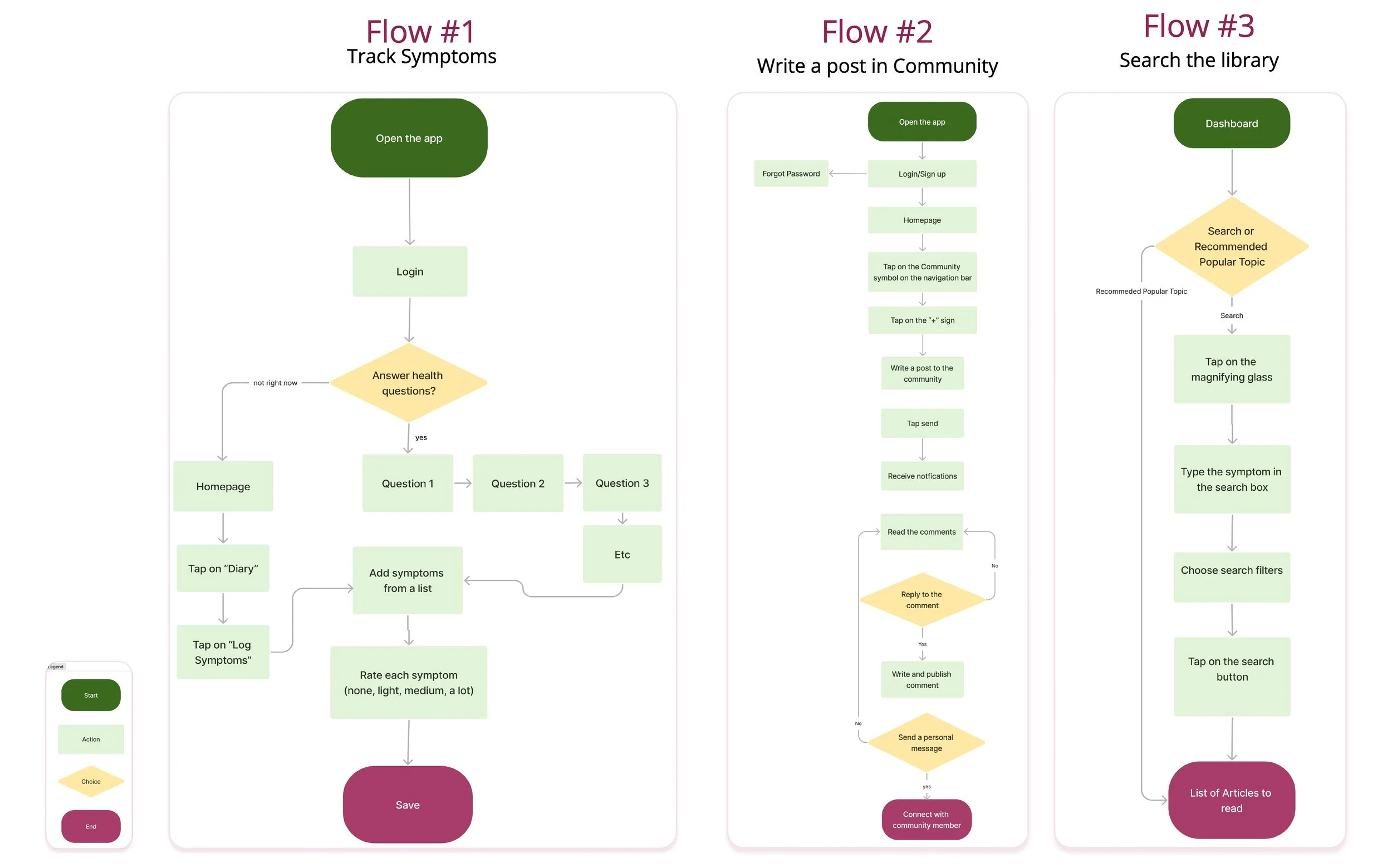
After conducting research and interviews with users, it became clear that Meno On the Go needed to address two key needs:
Provide reliable information
Foster a sense of community
I developed two distinct user flows that aimed to satisfy these requirements. However, I also recognized that many users may not be fully aware of what they need to manage their perimenopause symptoms effectively. This realization inspired me to create a third user flow:
Symptom tracking and data collection.
In many cases, perimenopause patients feel like their doctors aren't listening to them or taking their symptoms seriously. By tracking their symptoms and compiling reliable data over time, users can bring factual evidence to their healthcare providers, which may help them receive more effective treatment. This user flow addresses an unmet need among perimenopause patients and empowers them to take control of their health.

I quickly drew a few wireframes and then, moved to the next step in the design process: creating a low-fidelity prototype. This prototype would allow me to test the functionality and usability of the app in a more interactive and realistic way. In the following sections, we will take a closer look at the design and testing of the prototype, and how it helped us refine and improve Meno On the Go.
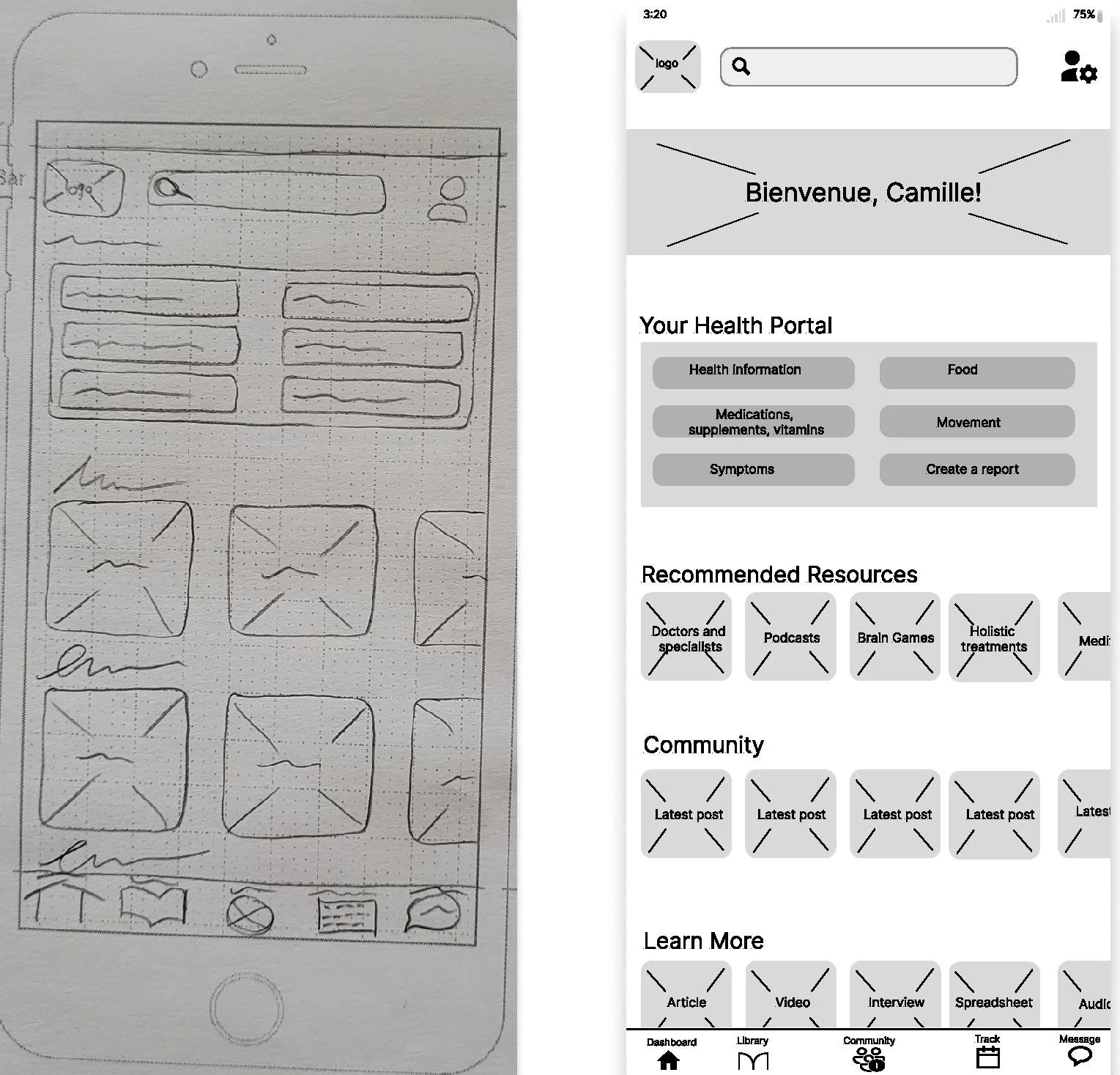
My intentions:
Make the users feel welcomed, seen, and acknowledged by greeting them by name and have information that is catered to them.
Easy access to what is important for them:
Relevant information
Community
Track their symptoms
in multiple places:
Navigation bar
Different sections on that page
Dashboard
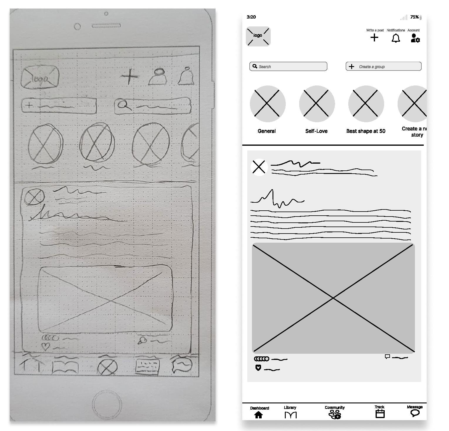
My intentions:
Offer everything on one page:
Individual posts
Access to groups
Write a message
Do a search in the Community
Create a group
Use a familiar interface for the new posts feed.
Community
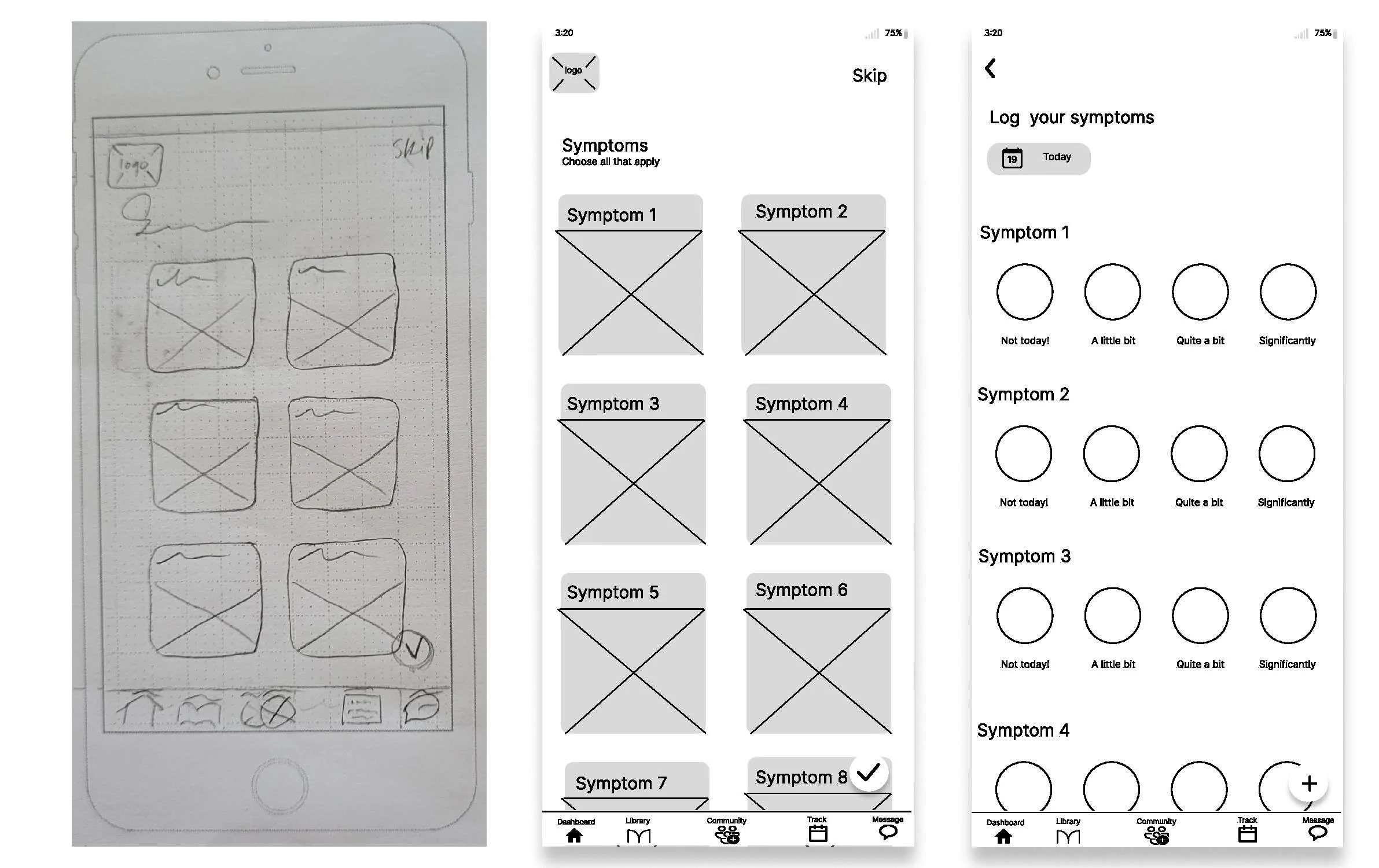
My intentions:
Offer an exhaustive list of symptoms with illustrations, to make the experience enjoyable, while educating. It will also allow us to better personalize the Dashboard with articles and information catered to the user. At the bottom of the page, the user can add their own symptoms.
Make it simple and offer easy ways to move from one page to another at anytime - represented by the bottom navigation bar.
Select and Track Symptoms


To ensure the app meets the needs of its intended users, I conducted six moderated online tests.
During the testing, participants were asked to complete various tasks:
Reading and posting in the Community,
Searching the Library for specific information,
Logging and tracking their symptoms.
The feedback from the testing was used to make adjustments to the app's design and functionality, with a focus on ensuring a smooth and intuitive user experience.
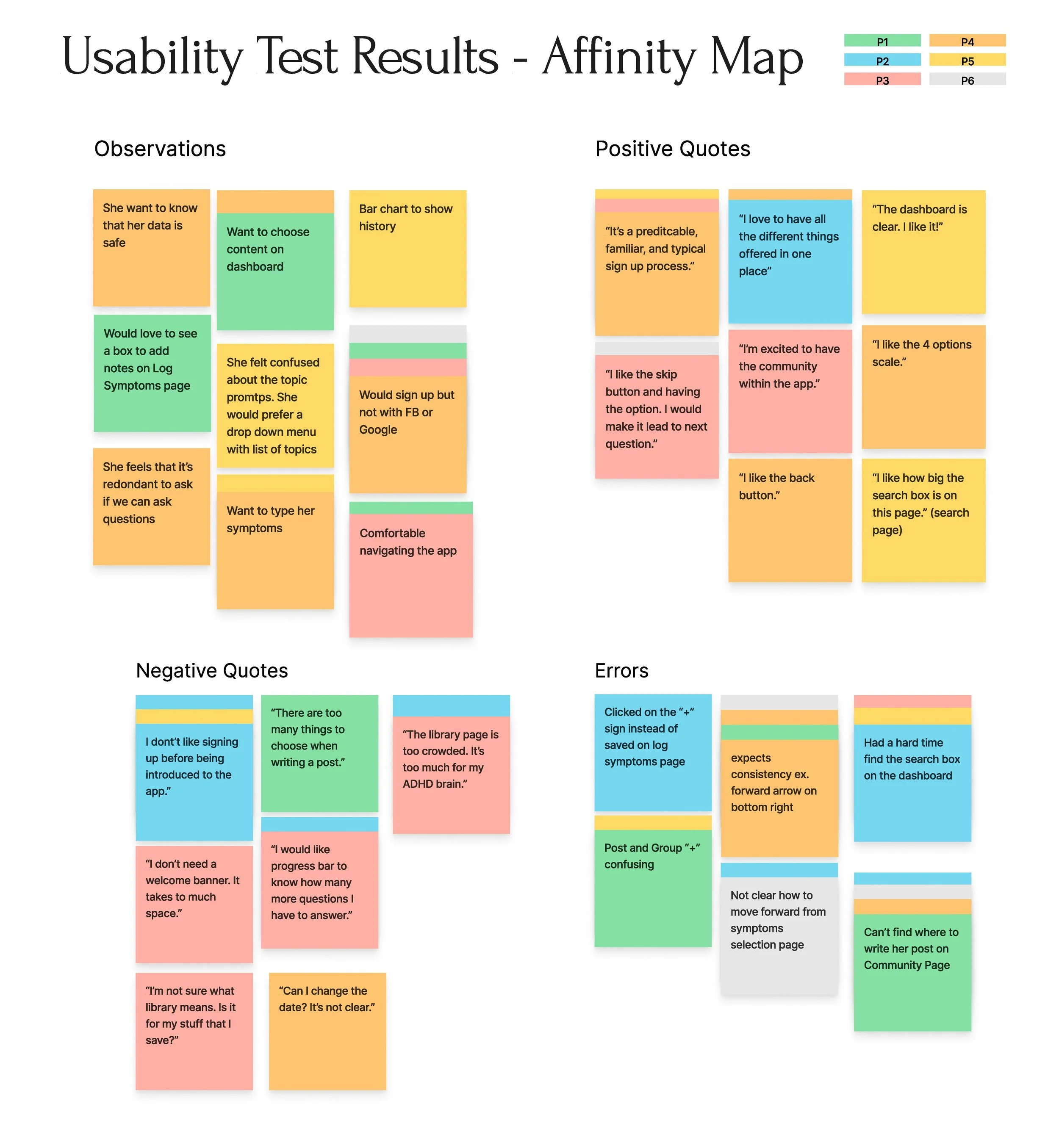
After conducting the usability testing, several key takeaways emerged.
All six participants expressed enthusiasm and a strong desire for an app like Meno On the Go. They found the concept to be unique and highly beneficial.
Overall, they found the app to be easy to use, but there were a few minor details that needed to be addressed, like a lack of consistency in the buttons and their placement.
One major point of confusion for the users was the community page. They were unsure how to write a post, which highlights the need for clearer instructions and more intuitive design in that area.
To address these issues, I made some changes to the high fidelity prototype, which I will share as examples next. Overall, the feedback from the usability testing was incredibly valuable and helped me to refine the app design to better meet the needs of the target audience.
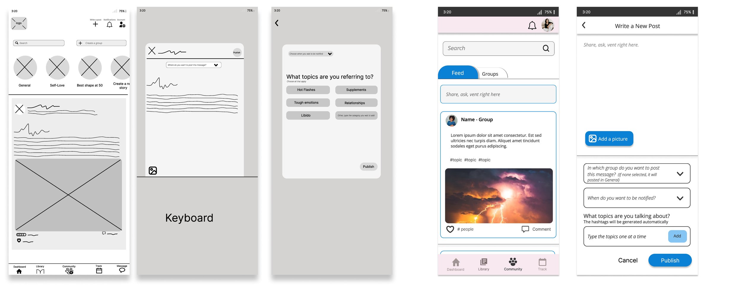
I simplified the Community and Write a Post screens by:
Putting a search bar that takes the whole width of the screen which makes it much easier for the users to find and type in.
Removing the groups at the top of the page as they confused many users and added a tab. It declutters the page and makes it clearer for the users.
Adding a text box and removing the + sign on top of the page as it was confusing for every users. None of them knew to tap on the + sign to write a message. The text box is a feature that is more familiar to the users and that’s what all of them were expecting to see.
Combining the two overlays into one screen. It reduces the risk of the window closing if they tap outside of it and the steps the user need to take to complete this task.
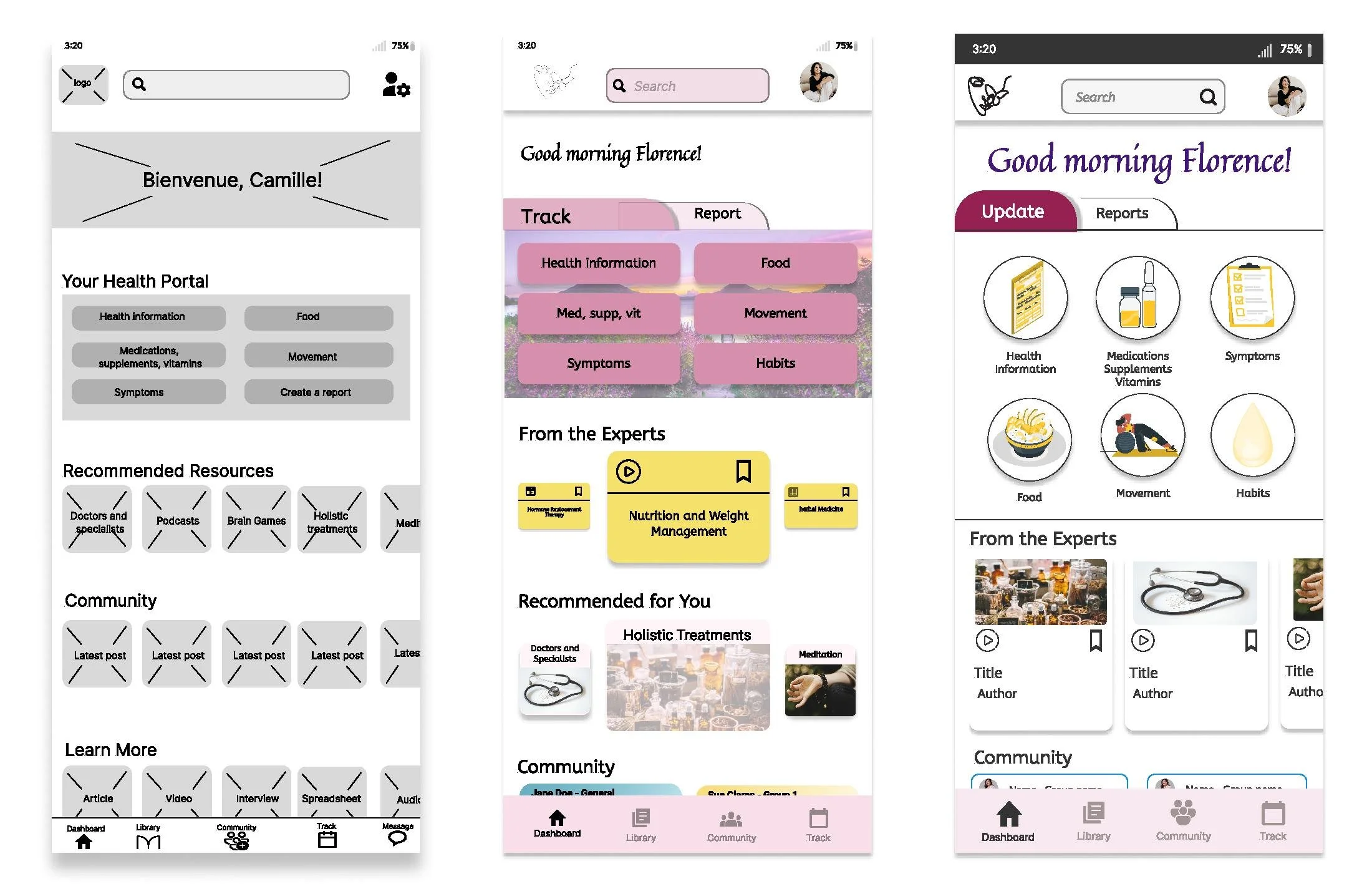
In general, throughout the app, in order to bring more consistency and clarity, I:
Increased the size of the buttons and made sure they were in a consistent placement as it was confusing for many users.
Used words instead of symbols within the buttons.
The other major change was to increased the size of the navigation bar and therefore the icons for ease. The 1st iteration was way too small and the users couldn’t see the words and the icons very well.
I also added tabs to the Tracking page to allow easy navigation between all they would like to track without overwhelming the users with information and to remove unnecessary steps.
The article and community cards in the first iteration were way too small and didn’t have enough space to contain information that would tell the user what it was about. I increased the size of the cards to allow for more information ad make it easier for user to decide if they wanted to know more or keep scrolling.
I removed the background picture on the top part as it was adding unnecessary busyness and it was distracting. Also, because there is a lot of sections and information on the dashboard, I wanted to create more white space to reduce the cognitive load.
A few users commented on the fact that all the options under Your Health Portal section were about tracking except Create a Report so I created a tab to differentiate the purpose of the actions and to make it easier to see what they could do.
Next, I will conduct a second round of usability testing and make more iterations based on the results.
Since many users mentioned that they wouldn’t sign up without knowing what the app was about, I created an Onboarding process that explains the features and benefits of Meno On the Go to make them feel comfortable and wanting to sign up.
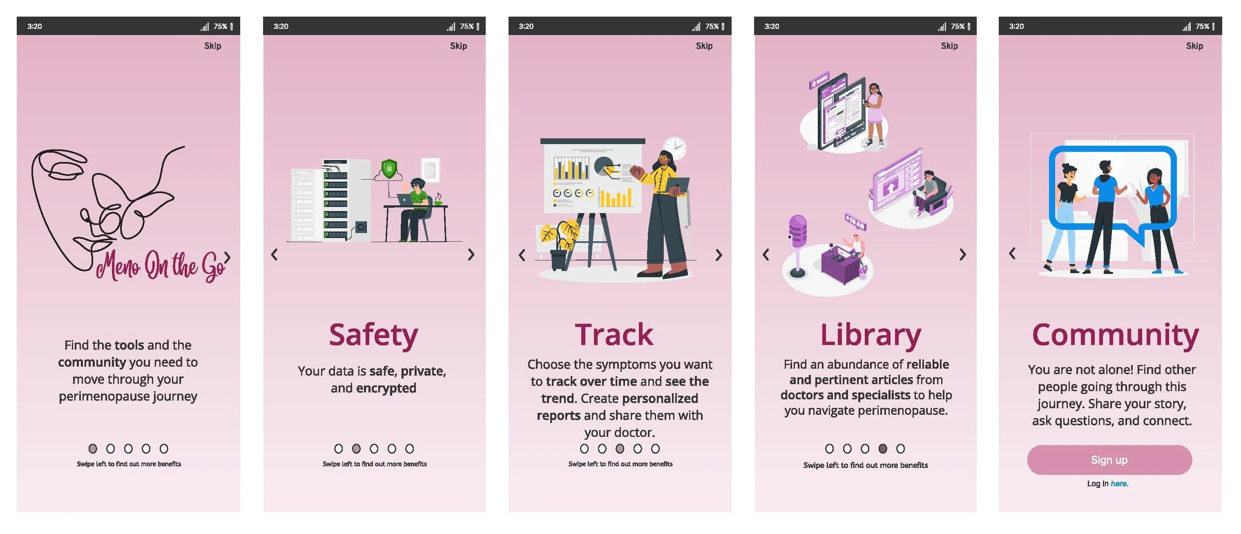

The Meno On the Go project was a challenging but rewarding experience. One of the challenges I faced was simplifying the presentation of an app that offers many features, but I was able to find solutions by testing and listening to user feedback.
Looking towards the future, Meno On the Go could benefit from adding some new features like:
A "Talk to an Expert" section could offer more personalized support to users,
The "Create a Report" feature would make it easier for them to track and share their progress with their healthcare providers.
Connecting with smartwatch technology would enhance the app's usability and convenience for users.
Adding access to compassionate and understanding healthcare professionals would be a valuable addition.
Integrating some of the ways AI could be used for Meno On the Go would be an exciting opportunity for future development.
Throughout the project, I focused on addressing the primary pain points identified in the user research, which included providing relevant information about perimenopause, tracking symptoms, and building a community for support. The usability testing revealed that the users loved the app's design, and appreciated having everything they needed in one place. However, there are still areas for improvement, such as offering support and inspiration for users as they navigate the challenges of lifestyle changes and offering nutrition and exercise programs.
Look at my other work: